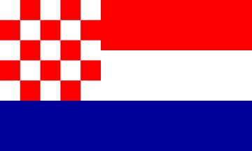
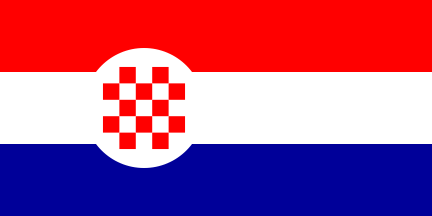
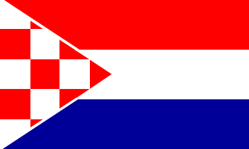
Here are presented some of the 1990 proposals for the flag of the Republic of Croatia published in media.Design: Stjepo Martinović, a journalist from Zagreb


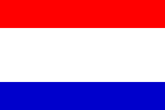
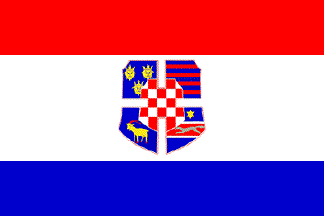
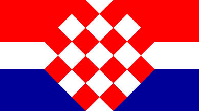
Martinović proposed redesign of the traditional tricolor of 1848 obtained by joining of the red-white bicolour of Croatia Proper and white-blue of Slavonia, to be made the same, but without the overlap of the two white stripes, making the central white stripe of double width. The central stripe would contain the state arms in the ceremonial (state) flag. The arms would be composed of the chequy shield with the foud white central edge squares "voided" extending into a voided cross made of four outer shields, Dalmatia, Dubrovnik, Istria, and Slavonia.
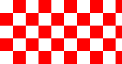
Design: Boris Ljubičić, academic painter and graphical designer from Zagreb


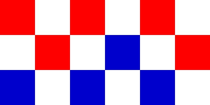
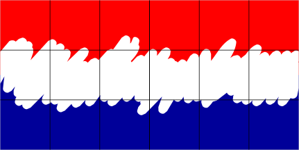
Boris Ljubičić initiated in Danas a series of articles discussing a design solution for the new flag of Croatian in 1990. He proposed a flag based on a chequy pattern with red, white, and blue cheques. The author never gave up on the idea and more or less actively works on its publication as part of his project for the new visual identity of the Republic of Croatia. The design was also used in the intro jingle on the Croatian TV for the elections for the Sabor 2000 and the elections for the Civic assembly of the City of Zagreb. At the same time, he proposed a flag of red-white-blue with the white line artistically wavy depicted. The published illustration included also thin black chequy mesh, that might have not been intended as part of the design. In any case, eventually, the political party HNS adopted that design (without the mesh) as the party flag.
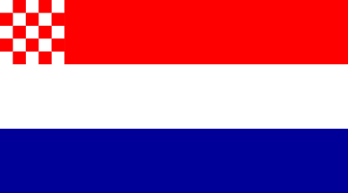
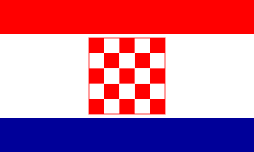
Design: Krsto Anton Mažuranić, writer from Samobor

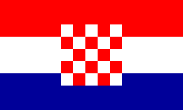
According to the article, Mažuranić sent the formal proposal to the Constitutional Committee and published it in media. The flag is tricolour of red over white over blue with a chequy 5×5 white-red field in the canton covering the two first stripes. A number of subsequent discussion in Danas cite this example as most acceptable "organically interlinking the coat of arms and the tricolour."
Design:
Tomislav Gotovac, film and conceptual artist from Zagreb


The design by Gotovac was described only, visualized by the Danas editorial team. The first proposal includes the chequy field of squares in five rows, filled as long as required, with the fly column "unfinished", while the second retains the traditional 5×5 chequy field of elongated rectangles.
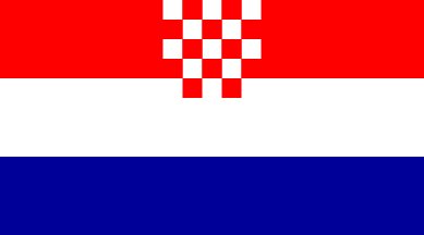
Design: Danijel Popović, graphical Designer from Zagreb


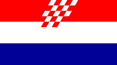
Popović provided variations or "critique" of Mažuranić's proposal, what he considered "graphically more optimal", removing the chequy field in the canton covering only the first stripe. The second one sets the chequy field in the centre of the red stripe, entering the white one with the bottommost row, that he titles "unorthodox variant". In the third design, the chequy field from the previous is squwed.
Design: Davor Turković, Zagreb

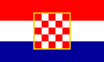
Turković proposed the chequy field (or the coat of arms) to be set the centre of the tricolour with the top and bottom rows entering the red and blue stripes and outlined with a yellow ribbon.
Design: Vladimir Buzolić Stegu, a graphical designer from Zagreb


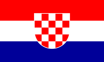
Buzolić Stegu proposed a similar solution with the square or shield-shaped chequy field entering the red and the blue stripe. The state flag would have, according to him, the same design, but instead of the white, there would be silver cheques and outline. The presidential flag would be of the same design, but in square form and with silver fringe.
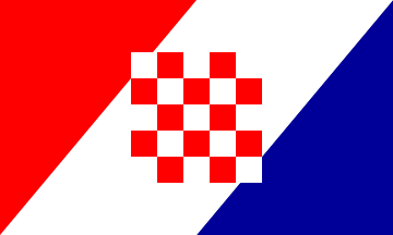
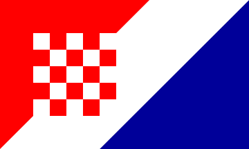
Design: Ivan Majstorović and Boris Malešević, design studio "Free"


Majstrorović and Malešević proposed diagonal tricolour without the chequy field or with it in the centre of offset to the hoist.
Design:
Denis Kuljiš, a journalist from Zagreb

Kuljiš proposed that the traditional simple undefaced tricolour of red-white-blue is adopted. For the coat of arms, he proposed the one as appearing on the St. Mark church roof in Zagreb, of Croatia, Dalmatia and Slavonia.
Design: Dejan Kršić, designer from Zagreb


Kršić considered making the difference from the Netherlands and other similar tricolours by enlarging the central white stripe, and that the flag should have two variants, with (state) and without (civil) the square chequy field.
Design:
Predrag Raos, writer from Zagreb

Raos wanted to interlink the chequy field and tricolour organically, following Mažuranić's ideas, by rotating the cheques and changing the size of the white stripe.
Design: Marijan Jevšovar, acedmic painter from Zagreb

Jevšovar pointed out that composing other shapes with a square requires curved complements, similar to the oldest seal showing the chequy field, and proposed setting the field in a white disk offset to hoist, for better optical effect.
Design: Antonio Grgić, Koprivnica

Grgić writes on his proposal: "When the discussion about this was actual I sent the design to various daily news editors, but to my knowledge had not raised any interest. ... The idea was to maintain the traditional minimum in the shape of the tricolour but to introduce a dynamic element introducing a forward movement. It avoids the static effect of the classical solution with the coat of arms in the centre. It would make a unique design, indirectly inspired by the Czech flag."


 by Sotir Thu Jun 11, 2020 3:05 pm
 Janko Suvar


